How to optimise your event page to sell more tickets
In this guide, we’ll look at event page best practices that help boost ticket sales, from stronger calls to action to smoother checkout flows and smarter use of trust signals. Let’s go.
Share
Getting people to visit your event page is a big achievement, but the work’s not done yet! The next challenge is turning that interest into action.
A high-converting event page helps more browsers become actual attendees. Small details can make a big difference: the way your page is structured, how clearly your event is explained, how easy it is to check out, and how much confidence people feel before they click “book now”.
In this guide, we’ll look at event page best practices that help boost ticket sales, from stronger calls to action to smoother checkout flows and smarter use of trust signals. Let’s go.
What is conversion rate optimisation (CRO) for events?
Conversion rate optimisation (CRO) is the process of improving your event page so that more visitors take the action you want them to take.
For event creators, that usually means buying tickets, but it could also mean registering interest, signing up for updates, joining a waiting list, or submitting an RSVP.
Let’s say 1,000 people visit your page and 20 buy tickets. Your conversion rate is 2%. If a few smart changes help that number rise to 4%, you’ve doubled your sales without needing more traffic. Which is pretty cool, when you think about it.
A surprising number of people abandon event pages because something feels unclear or frustrating. Maybe the ticket button is hard to spot. Maybe the pricing feels confusing. Maybe the page asks for too much information before checkout. Sometimes people simply aren’t convinced the event is worth attending.
Good event page optimisation removes those blockers. It helps people decide faster, with less hesitation.
🚀 Time to boost ticket sales: How to create a high-converting event page
A strong event page makes buying feel simple, obvious, and exciting.
These event landing page best practices will help you create a page that gives people the confidence to book, and fewer reasons to leave.
Nail the first impression above the fold
Above the fold means everything people see before they scroll.
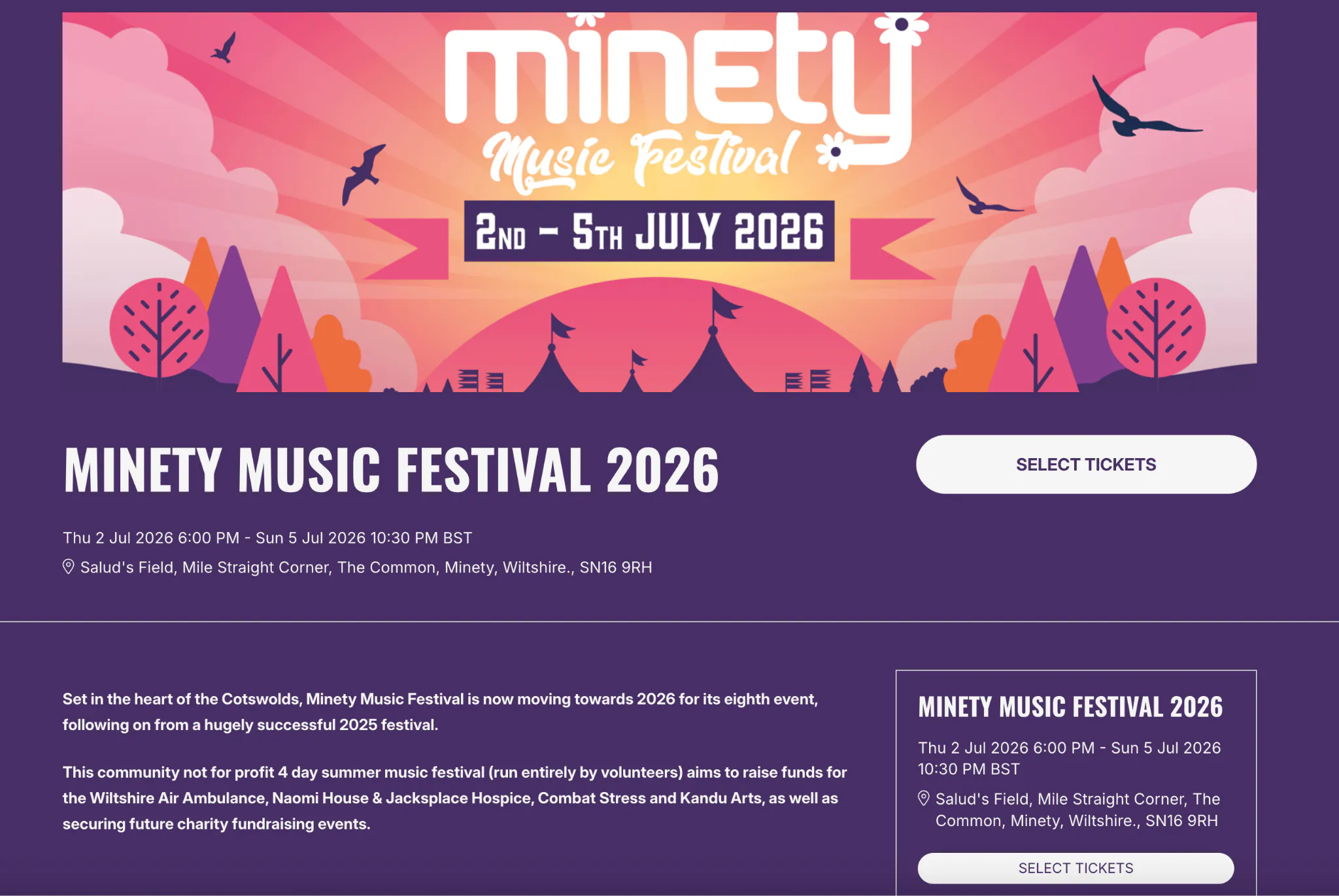
This section does a huge amount of work. It’s where someone decides whether they’re in the right place and whether your event feels worth their time (and money).
Your essentials should be immediately clear:
Event title
Date and time
Location (or virtual access details)
Your main call to action
If someone has clicked through from social media, an email, or a paid ad, they should be able to confirm within seconds that this is the event they expected. This can be achieved through using strong branding and a clear event description; ensuring the first couple of sentences relay the most important information.
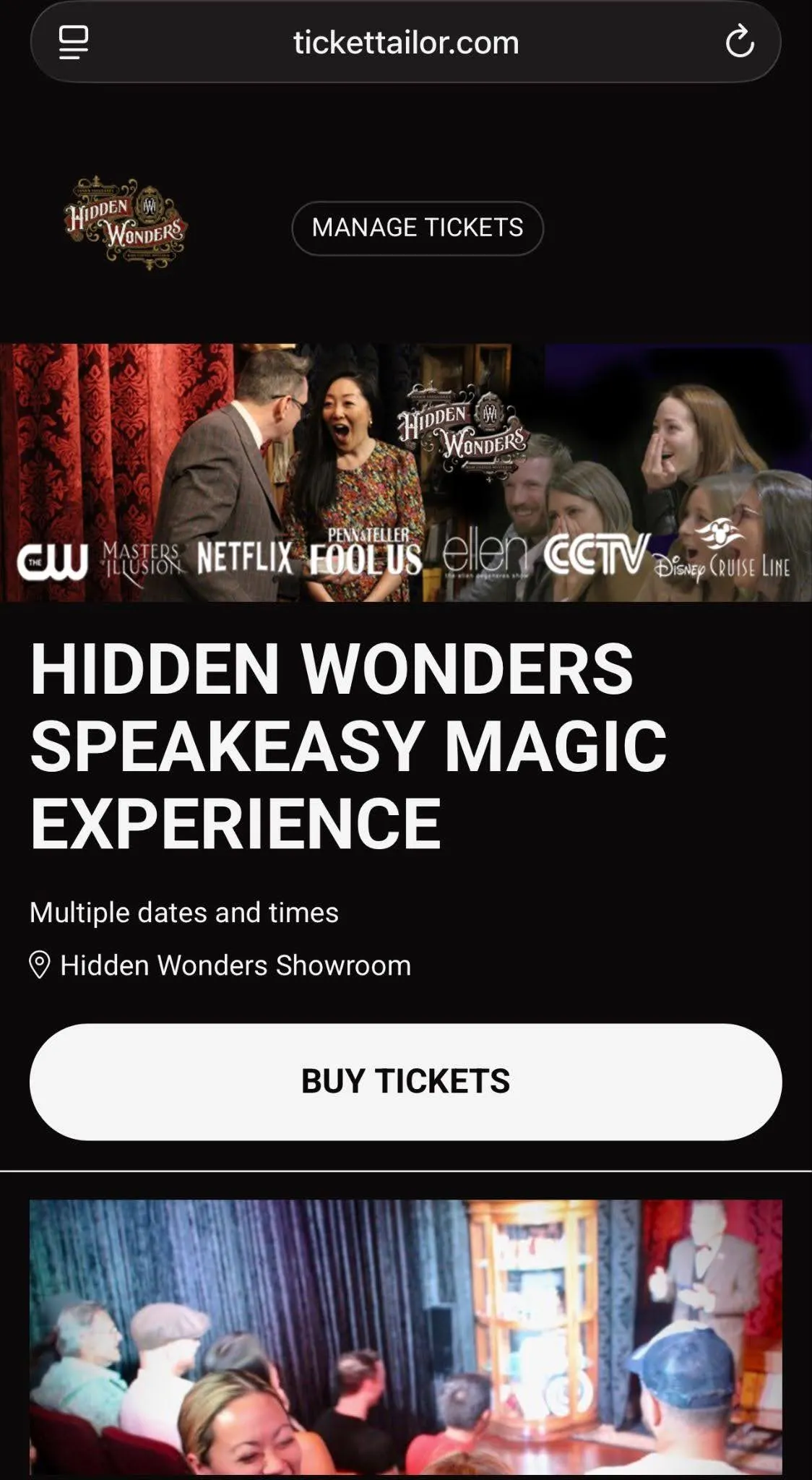
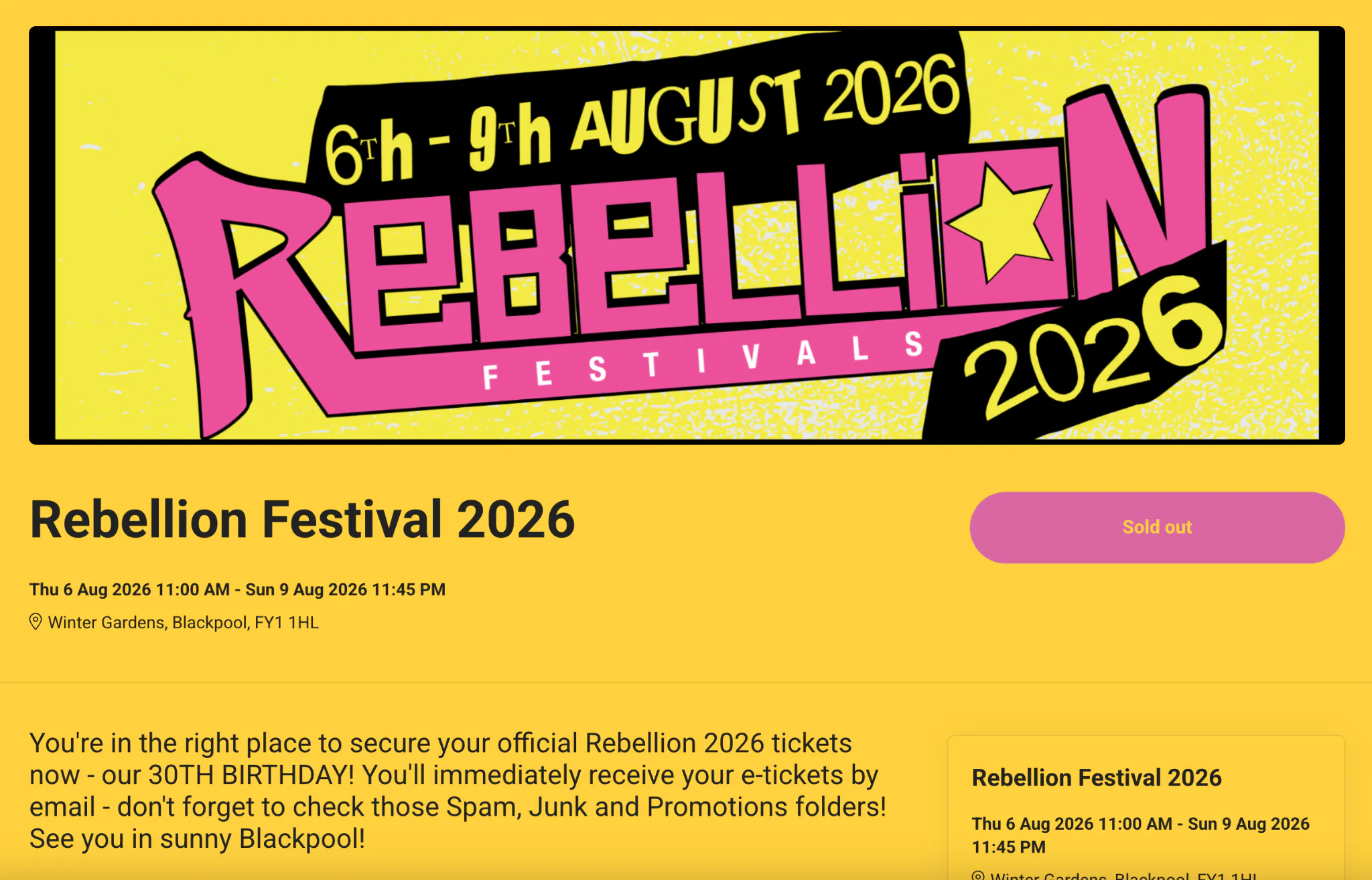
When it comes to visuals, bold hero images, trailers, speaker videos, or past-event photography can quickly create trust and excitement.
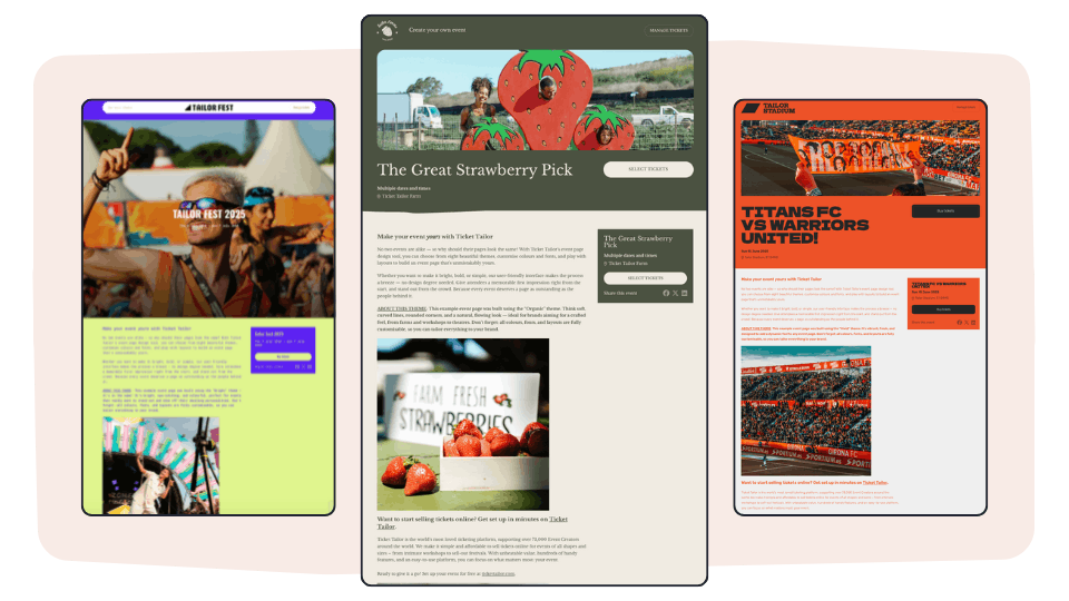
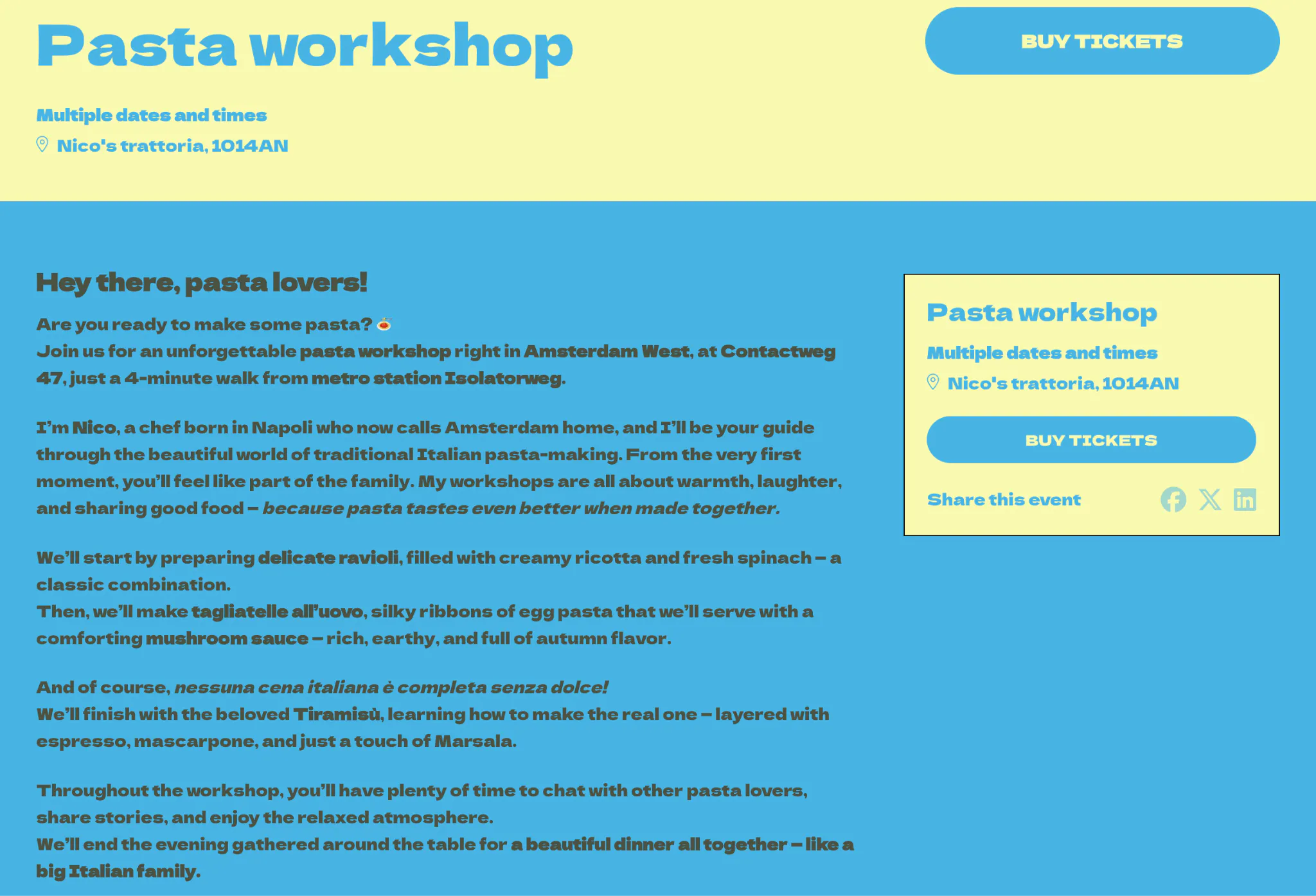
This is also where good design pulls its weight. A clean, branded page with strong visuals and a prominent CTA instantly feels more trustworthy. Tools like Ticket Tailor’s event page builder make this easier with customizable event pages, branded headers, and flexible design options that help your event feel polished from the first click.
Consider the length of your page carefully
The overall length of your landing page can also have an impact on how people feel about registering or buying tickets. It all basically boils down to how much information people need to feel confident in making that decision.
For example, some events need very little convincing. A £10 comedy night, a local food market, a casual community workshop are all pretty low-stakes events when it comes to decision-making. People already understand the offer, the commitment is minimal, and too much copy can actually slow the whole process down.
Other events will need more detail.
If someone is considering a £400 conference pass, a weekend festival ticket, or a multi-day retreat involving travel and accommodation, they’ll want reassurance before they commit. They need enough information to justify the spend.
Generally, the higher the price, commitment, or uncertainty, the more your page needs to do.
That’s not to say you need to write endless paragraphs but you’ll definitely need to answer the questions people naturally have:
What exactly am I getting?
Is this worth the price?
Is this event well run?
Will people like me be there?
What happens if plans change?
Long-form copy works when it helps people decide. To get this right, it’s worth bearing in mind this simple principle:
People don’t necessarily dislike long pages, they dislike poorly written and badly structured pages.
If your content adds clarity and takes the reader through a natural flow of useful information, it can absolutely convert better.
Have one clear CTA and make it obvious
Every event page should have one clear primary action. Usually that’s booking tickets.
Problems start when pages try to do too much at once: buy tickets, join the newsletter, follow on Instagram, read the blog, download the brochure, maybe solve a small puzzle on the way! 😅
In other words: too many options create hesitation.
Your CTA should be visually obvious at top-of-page, and 100% clear in terms of the action you want users to take.
On mobile, sticky CTAs can work particularly well (that’s where the button remains prominent on the page even as users scroll). If someone is ready to buy while reading through your page, it’s best if they don’t need to scroll all the way back up to do it.
On mobile, sticky CTAs can work particularly well. If someone is ready to buy while scrolling, it’s best if they don’t need to scroll all the way back up to do it.
One page. One main goal. Everything else should support that.
Sell the experience and lead with benefits
A really great event page should instantly answer the question: why bother attending? This can be done in a few different ways:
You can help people to immediately understand what tangible benefits they’ll gain
You can instil a sense of excitement with atmospheric descriptions and visuals
You can remind people what they’ll miss out on if they don’t attend
For example, a workshop should focus on the outcome. What will attendees leave knowing, doing, or feeling more confident about?
A conference might choose to highlight the moments people don’t want to miss: standout speakers, exclusive sessions, useful networking, the venue itself.
A festival should build atmosphere. Great visuals, artist highlights, past crowd shots, and language that creates anticipation all matter more than a long block explaining parking arrangements.
Sometimes a little FOMO helps too.
If a band is playing their only UK date this year, say that. If early bird tickets are nearly gone, make it visible. If your retreat only takes 20 guests, that scarcity is part of the appeal.
Specificity sells better than generic hype.
“Live music and great vibes” tells people very little. “Sunset DJ sets on the clifftop stage, with wood-fired pizza and local craft beer” paints a much clearer picture.
Reduce buying hesitation with trust signals and social proof
People want proof before they part with money. Trust signals and social proof help reduce that little voice asking: Is this legit? Will I regret this later?
That hesitation is normal, especially for higher-ticket events, and the easiest way to reduce it is by showing that other people have already had a good experience.
That could include:
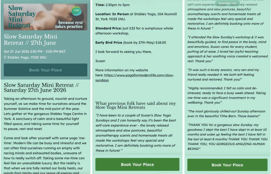
Testimonials from past attendees
Reviews on Google or Facebook
Photos and video footage from previous events
Recognisable sponsors, speakers, or partners
Press mentions
Clear refund policies
Secure checkout messaging
Some combinations work especially well. For example, testimonials are powerful for workshops and classes, because people want proof of results. Festivals benefit hugely from strong video footage because atmosphere is hard to explain in text. Attractions like theme parks or seasonal experiences often rely heavily on reviews because families want reassurance before booking.
This is also something you can actively build over time.
After your event, ask attendees to leave a review. Most happy customers will do it if prompted, they just need the nudge. Be specific about where you’d like reviews left, whether that’s Google, Facebook, or another platform that matters for your audience.
A page filled with reviews, testimonials, and real attendee experiences gives people fewer reasons to hesitate, and a much stronger reason to click “Book now.”
Simplify the checkout process (and any other forms)
The checkout stage is where people move from interested to committed, so it should feel clear, straightforward, and easy to complete.
Research from Baymard Institute found that extra costs, forced account creation, and long or complicated checkout processes are some of the biggest reasons people abandon purchases. The same applies to event ticket sales; if the process feels confusing or unexpectedly time-consuming, some people will leave before finishing.
That doesn’t mean every checkout should be stripped back to the bare minimum. Some events naturally require more information. For example, conferences might need dietary requirements, accessibility requests, or company details. But it’s important to make sure every step feels necessary and easy to follow.
A smooth checkout usually includes:
Minimal required fields
Simple ticket selection
Transparent pricing from the start
Clear refund terms
Mobile-friendly payment flow
No surprise booking fees appearing at the last second
Ticket tiers matter too. If there are too many options with unclear differences, people can end up pausing rather than purchasing. A simpler structure is likely to perform better than six slightly different ticket types that require too much comparison.
The easier it is for someone to understand what they’re buying and complete the process confidently, the more likely they are to follow through.
Consider using scarcity messaging
People are more likely to act when there’s a chance they might miss out on something they want. Which is why tactics like using countdown timers and scarcity messaging can work so well for event sales.
An early bird deadline, limited-capacity workshop, final release tickets, or “only 12 spaces left” messaging creates urgency by making delay feel costly.
Psychologically, this taps into something called loss aversion; people are more motivated by the fear of missing out than the possibility of gaining something later.
But of course, it’s important to keep things honest, as fake urgency is easy to spot and can end up being offputting. If your “final few tickets” message has been sitting there for three weeks, trust disappears fast.
Offer multiple payment options
Payment flexibility can improve conversions, especially for higher-value tickets where people may need a little breathing room before committing. For example, Buy Now, Pay Later options can help with larger purchases like festivals, conferences, retreats, or family attractions where the upfront cost feels heavier.
Offering options like Apple Pay and Google Pay can also be invaluable, helping mobile users move quickly without typing card details on a train with 4% battery!
💡Tip: Ticket Tailor supports options like PayPal Pay Later, alongside digital wallet payments, helping organizers reduce friction right at the final step.
Use strong visuals and branding
Your event page should feel like the same event people saw advertised elsewhere.
If someone clicks through from an email campaign or a paid ad, for example, consistent branding helps them instantly recognise they’re in the right place. Same colors, same tone, same visuals, same event identity.
This sort of familiarity builds trust, and also prevents that awkward moment where someone thinks: Wait… is this actually the right link?
Strong visuals do more than make a page look nice. They shape how professional and credible your event feels. Clear photography, branded graphics, strong typography, and thoughtful layout all influence whether people trust the experience enough to buy.
This matters even more for first-time events where people don’t already know your brand, as a polished event page ultimately signals competence.
💡Tip: Ticket Tailor’s event page builder gives organizers a lot more control here, from custom branding and design flexibility to pages that feel like an extension of your own website rather than a generic checkout screen. All of this makes for a buying journey that’s smoother, and more trustworthy.
But how do you measure whether changes to your event page are actually having an impact?
If you’re serious about measuring and optimising whether the changes you’re making to copy, design and other elements we’ve spoken about are actually making an impact then we’d definitely recommend connecting your website or event page on Ticket Tailor up to Google Analytics.
Through Ticket Tailor this is easy, simply follow our Google Analytics integration guide which works for Ticket Tailor event pages and custom domains using Ticket Tailor to power their ticketing. If you’re not using Ticket Tailor then you’ll need to set this up manually or check that your ticketing provider facilitates this.
What will GA4 let you measure
Through GA4 (Google Analytics) you’ll be able to measure the number of people landing on your event page and then a step by step view of how many people begin and complete the basket process. In doing so you’ll have numerous conversion points that tell you where people are dropping off:
Landing page viewed to ticket added to basket conversion rate
Ticket added to basket to checkout initiated
Checkout initiated to purchase complete
Having this oversight will help determine whether changes you’re making help optimise your conversion rate.
🎟️ Turn more visitors into ticket buyers with Ticket Tailor
A strong event page helps people make a decision faster. It answers questions before they’re asked, builds excitement around the experience, and makes booking feel simple and low-stress.
Most of the time, improving conversions comes down to small adjustments rather than major changes. A clearer headline, stronger social proof, better visuals, or a smoother checkout flow can all have a real impact on how many visitors follow through and buy.
It’s worth revisiting your event page regularly, especially if ticket sales feel slower than expected. A few thoughtful improvements can make a surprising difference to how confident people feel about attending your event in the first place.
And of course, having the right ticketing platform helps 😎. Ticket Tailor is built to make creating high-converting event pages ultra intuitive, with tons of customisation options, simple checkout flows, flexible payment options, and transparent pricing.