Introducing Ticket Tailor’s brand-new Box office design tool + real-life examples
Our brand-new Box Office design tool offers eight fresh, customizable themes to help you stand out, sell tickets seamlessly, and bring your brand to life. Join 484+ Event Creators who’ve made the switch within 48 hours of launch (!) and discover real-life success stories in our latest post.

Meet the new era of event page design
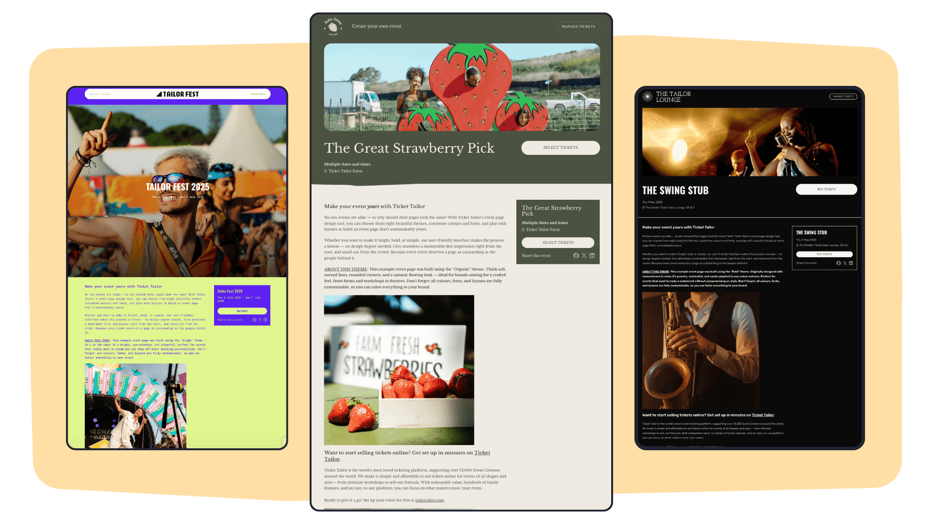
No two events are alike — so why should their pages look the same? We’re delighted to unveil our new Box office design tool: an event page builder that helps you craft stunning, on-brand pages to showcase your unique event and sell tickets online with ease. And we’re not the only ones excited about it. In the first 48 hours since launching, over 484 Event Creators have already adopted one of the eight new themes! The most popular pick so far? Base, followed closely by Bright and Bold. (More on these below, along with some brilliant real-life examples we spotted in the first week.)
A step ahead of the competition: own your design
“The new box office designs really stand out amongst the crowd. The ticket buyer experience begins with buying their ticket, and the customisation and photography lets you put the feel of your event center-stage. Unlike many of our competitors' pages, these event pages center the event itself, not the ticketing site’s own brand. This really builds excitement. Plus, the new pages are so quick to build but they look so professional - competing with expensive and fiddly websites. I love seeing the varied designs being customized to suit a wide range of events so well!” – Rhio, Head of Customer Experience
Why the new Box office design tool?
We believe every event deserves a page as outstanding as the people behind it. That’s why we’ve introduced:
- Eight brand-new themes (with oodles of room to personalise them further)
- Color and font customisation to suit your brand
- Fresh layout options from headers to event listings
- Quick and easy set-up – no coding or design skills needed!
Simply put, this tool gives you total freedom to design an event page that stands out and wows your guests. Even better, it helps you sell tickets online by making your event look unforgettable.
“As we've grown bigger and bigger, it was really frustrating for us to see how bland, dated, and undifferentiated all our event creators' pages ended up being – despite the passion, effort and care they put into crafting these amazing experiences. We realized that we were constraining people due to the limited tools we'd made available: meanwhile they would often have these stunning and original websites and brands off the Ticket Tailor platform – full of distinctive character. It felt like the right move for us to provide creators with creative tools for styling their box offices – to unleash that inventiveness – and we're really enjoying seeing how varied and individual the results are.” – Tom, Product Director
How long did the event page tool take to develop?
“The new design studio was built from the ground up and took about 3 months of solid work to develop. We iterated over a number of designs, making many refinements before settling on what we have, a tool that’s intuitive, fun, yet powerful. But this is not the end of the development process, we will continue to improve and build upon this amazing tool over time so event organizers on Ticket Tailor can have the best design tool to make the best looking event pages at their disposal.” – Wing, Product Developer
Get inspired: Real-life event pages
We’ve made it simple: pick a theme, customize everything (color, font, layout — you name it), and watch your box office, listing page and event pages come to life.
Nothing beats seeing the possibilities in action. Throughout our launch week, we’ve been blown away by how creative our Event Creators have been. From vibrant pop-ups to sophisticated galas, you’ll find real examples of the Box office design tool transforming an ordinary ticket page into something spectacular.
1. Base: clean and versatile

Designed for anyone and everyone, Base is a clean, fuss-free theme. Brilliant if you want to get your event page up and running in seconds.
Examples in action:
Pro tip: If you're main logo is the same color as you choose for the Header background, you won't be able to see it! Make sure you choose contrasting colors to help your logo stand out.
2. Bright: A burst of color

Fun, eye-catching, and jam-packed with personality. Perfect for events aiming to dazzle their audience (think festivals, carnivals, or creative workshops).
Examples in action:
Pro tip: You can add unique links into your header, for example, The Better Business Network has added links to "Join The Community" and "Contact us". You might want to consider linking ticket-buyers to your website, social media, news, or Product store.
3. Simple: Straight to the point

If you like minimal fuss, this theme is your new best friend. It keeps everything easy to navigate and super-clear for attendees.
Examples in action:
Pro tip: Don't forget to play around with the best listing page layout (list or grid). If you're hosting lots of events, the grid layouts can make it easier for your ticket-buyers to navigate. Both Wild Coast Hebrides and Offbeat have chosen the three grid layout. Not sure which to pick? Your ticket-buyers can also toggle through the views, so just think about what you want them to see first.
4. Organic: Natural and crafted

Soft lines, rounded corners, and a flowing layout for a handmade touch. Ideal for workshops, artisanal fairs, or theater shows wanting a warm, welcoming feel.
Examples in action:
Pro tip: Consider the color of your CTA's (call-to-action's or to the everyday person 'buttons'), after all contrasting colors can prompt action. All of these examples showcase attention-grabbing CTA's, except the case of Mountain Marcus that's kept it cream and on-brand with the rest of the page theme. There's no right or wrong here, so play around and try testing what works best for you.
5. Basic: No-frills design

Straightforward, streamlined, and super-easy to customize. Great for charities, historic houses, or any event where less is more.
Examples in action:
Pro tip: See which header suits your event best – in these examples, Stanford Hall has gone for a full width header, while Fine Day Fair has chosen the 50:50 split. It's always worth paying attention to how any titles or writing appear once they're overlaid.
6. Bold: Make a statement

Punchy, minimalist, and originally designed with monochrome in mind. Adapt it to any color scheme for a striking result.
Examples in action:
Pro tip: Ticket Tailor integrates with Google Maps to allow users to add maps to their event pages, helping attendees find event locations easily. This feature is enabled automatically when an event is created, with a Google Map being added to the event page by default.
7. Clean: Sophisticated and modern

Crisp lines and white space set the tone for an elegant, contemporary look. Perfect for upmarket events where polished design is key (think ticketing for museums, galas, launches, or stylish soirées), or events that want to keep info easy to digest.
Examples in action:
Pro tip: You can even customize the color of borders in your listing. For example, head to Ilkley Manor House Trust listing page and click to view their events in the list format – you'll notice each event is surrounded by a pink border, giving a nod to their brand.
8. Vivid: Vibrant and fresh

Dynamic, energetic, and full of life. Perfect for sporting events, live gigs, or anything with a bit of a kick.
Examples in action:
Pro tip: You can upload multiple photos to your header to create a carousel – check out the Ideas Community header which has 6 photos on automatic rotation, helping to really highlight the variety of their events, from dinners to award shows.
See it in action: Watch our ‘How-to’ video
Ready to dive in? Our step-by-step tutorial walks you through everything from selecting your theme to fine-tuning the final flourish.
Pro tip: Our new design tool isn’t just about looking good. By making your event page easy to navigate and instantly recognisable, you’ll be well on your way to increasing ticket sales and boosting your brand’s visibility.
Prefer following instructions? Read our help center guide.
Start designing your event today
Eager to give your ticketing experience a unique stamp? We can’t wait to see the event page designs you create using our new event page builder. From the all-rounder Base to the eye-popping Bright and beyond, these themes are yours to play with.
Log in to your Ticket Tailor Box office, head to ‘Settings’ then ‘Box office design’, and transform your event’s presence in moments. After all, no two events are the same — and neither should their pages be.
New here? Sign up to Ticket Tailor for free and start playing around with our Box office design tool straight away. We have the cheapest ticketing fees on the market, and it's free to ticket your free events on our platform.


